

Accessible forms in HTML: required fields, error messages and validation


A red border around a field means nothing to someone who has trouble seeing red, or to someone using a screen reader. An accessible HTML form says in text which fields are required and, after submission, which field has an error and how to fix it. Here we fix a sign-up form in plain HTML, without frameworks or custom components, then test it with NVDA.
A sign-up form, from typing to submitting
#What each form field must announce before anyone types?
Before anyone types, each field has to make three things known: its name, its type and, if it has one, its format rule. WCAG, the international web accessibility guidelines, call for labels or instructions wherever input is expected, and for the format when the input follows rules. Their author, the W3C, also warns that too many instructions do as much harm as too few.
Laws in the US and in Europe rely on these guidelines. The Justice Department's rule that applies the Americans with Disabilities Act to state and local government websites makes WCAG 2.1 Level AA the standard to meet. For businesses, the department's web guidance lists inaccessible online forms among the barriers to avoid. In Europe, the European Accessibility Act has covered e-commerce since June 28, 2025. The European standard for digital accessibility, EN 301 549, takes its web requirements from WCAG.
Take Umbel Seeds, an online shop that sells heirloom seeds by the packet. Its “Create your account” page asks for a first name, an email address and a password of at least 12 characters. All three fields are required.
 Marker 1. The red asterisk after “First name”, which nothing explains. Marker 2. The hint “12 characters minimum”, below the Password field, tied to no field. Marker 3. The “Create account” button, grayed out and disabled.
#Labels and field types
A field gets its name from a label, the <label> element, whose for attribute matches the field's id exactly. The browser then turns the label into an extra click target that activates the field.
Never use placeholder text (placeholder) as a label: it disappears as soon as the person starts typing. For a field with no visible label, see our guide to the aria-label attribute. Radio buttons also need a name for their group: see our guide to fieldset and legend.
The field type matters too. With type="email", a phone shows a keyboard suited to email addresses, and the browser can check the address format.
#Format hints
A simple format rule can go in the label itself: according to the W3C, this approach works reliably across browsers and screen readers. Outside the label, a hint lives in visible text, tied to the field by the aria-describedby attribute, which points to that text's id. This is a text passage associated with the field.
On the Umbel page, “12 characters minimum” is a gray paragraph below the field, tied to nothing. Move it inside the <label> element, right after “Password (required)”. The minlength="12" attribute gives the browser the same rule.
Avoid
 Marker 1. The hint “12 characters minimum”, below the Password field.
<label for="password">Password *</label>
<input id="password" name="password" type="password" autocomplete="new-password">
<p class="hint">12 characters minimum</p>Correct
 Marker 1. The hint “12 characters minimum”, inside the “Password (required)” label, above the field.
<label for="password">Password (required)
  <span class="hint">12 characters minimum</span></label>
<input id="password" name="password" type="password" required minlength="12"
autocomplete="new-password">Why. Inside the label, the hint becomes part of the field's name, which the browser passes on to assistive technologies. Plain HTML does the job, with no ARIA attribute.
#How to mark required fields in an HTML form?
A required field is marked twice: with a visible indication for everyone, and with the required attribute for the browser and assistive technologies. The attribute alone is invisible. The W3C technique H90 puts the indication in the field's label, or in the legend of a group of fields, as a word or a symbol.
Color alone doesn't count as an indication. The W3C lists “required fields are red” among its examples of information provided by color, which another visual cue has to back up. The Justice Department's ADA guidance uses the same example: a screen reader doesn't announce text color, so a blind user never learns which red fields are required.
#A word in the label, or an asterisk
Write the word “required” in the label of each required field: “First name (required)”. The W3C forms tutorial puts “(required)” in the label, for people who don't use assistive technology. GOV.UK, the British government's design system, never marks a required field with an asterisk.
That is what we recommend: a word has no symbol to decode, and everyone reads it the same way, on screen or through a screen reader. Spell it out: the W3C notes that the abbreviation “req.” seems to confuse people.
DesignGouv, the French government's digital design team, accepts two approaches depending on how many fields are required: the word spelled out, or an asterisk explained in a sentence. Its design system, the DSFR, also asks for a visible note at the start of the form. The fixed form follows both: the word in every label, and the note at the start.
An asterisk explained in a sentence still works. H90 shows it, on one condition: the meaning of the symbol is explained before its first use, at the start of the form. The same technique warns that an asterisk is hard to see for people with low vision. Put the explanatory sentence before the <form> element: once inside a form, screen readers often switch to a mode where they read only the fields.
All three Umbel fields are required. Each label now says “(required)” after the field name, the sentence “All fields are required.” comes before the form, and the asterisk is gone.
#The required attribute and browser validation
In the code, the HTML required attribute carries the required state. The W3C says so in its recommendation, revised in August 2026: don't add aria-required="true" to a field that already has required. On its own, aria-required changes no behavior and doesn't block submission. If older examples set both attributes, remove that one.
With required, the browser does part of the work by itself: it blocks submission, shows its message in a popup and moves focus to the first field with an error. That message is generic and shows one error at a time. Depending on the browser, it vanishes quickly or doesn't grow with zoom. CSS can't style it, and it follows the browser's language, whatever language the page is in.
The fix is to keep required, type="email" and minlength, and to add novalidate to the <form> element. The browser no longer blocks submission or shows its popups, and the attributes keep their meaning. Your script still finds out what's wrong through the checkValidity() method and the validity property. MDN, Mozilla's web documentation, recommends exactly this: start from HTML, then improve the experience with JavaScript.
Your script listens for the form's submit event, which also fires when the person presses Enter in a field, as long as the submit button is enabled. DesignGouv asks teams to keep that behavior. GOV.UK makes a different call on required: it turns off browser validation as well, but bans the attribute.
At the top of the Umbel form, these choices add up to five changes. The sentence goes before the form, and the word “required” into every label. Every field gets required, the address gets type="email", and the form gets novalidate. The fifth, autocomplete, tells the browser which piece of the person's data the field expects, as WCAG requires.
Avoid
 Marker 1. The red asterisk in the “First name” label, unexplained. Marker 2. The red asterisk in the “Email address” label, unexplained.
<h1>Create your account</h1>
<form action="/account" method="post">
  <label for="first-name">First name *</label>
  <input id="first-name" name="first-name" type="text">
  <label for="email">Email address *</label>
  <input id="email" name="email" type="text">
  …
</form>Correct
 Marker 1. The word “(required)” in the “First name” label. Marker 2. The word “(required)” in the “Email address” label.
<h1>Create your account</h1>
<p>All fields are required.</p>
<form action="/account" method="post" novalidate>
  <label for="first-name">First name (required)</label>
  <input id="first-name" name="first-name" type="text" required autocomplete="given-name">
  <label for="email">Email address (required)</label>
  <input id="email" name="email" type="email" required autocomplete="email">
  …
</form>#Accessible form error messages: what to write and where to put them
An error message is text that names the field and says how to fix it. A red border can come on top. Place the message right below the field, as France's government design system, the DSFR, does in its text input component: the label, then the field, then the message. That way nothing comes between the label, hint included, and its field. The message stays tied to the field through the aria-describedby attribute.
#What to write?
Write one message per cause: an empty field and a malformed address are two different errors, and the validity property tells them apart. Reuse the words of the label and say what to do, in a few words, with an example when the format matters. The message has to make sense when read on its own.
Leave out “Please”, which makes the fix sound optional, and “invalid”, which tells the person nothing. These rules come from DesignGouv and GOV.UK.
| Field | Cause | Message |
|---|---|---|
| First name | EmptyvalueMissing | “Enter your first name” |
| Email address | EmptyvalueMissing | “Enter your email address” |
MalformedtypeMismatch | “Enter an email address in the format name@example.com” | |
| Password | EmptyvalueMissing | “Choose a password” |
Too shorttooShort | “Choose a password with at least 12 characters” |
In a W3C example, “Email is not valid” identifies the error, and a message that gives the expected format also helps the person fix it.
#How to tie the message to its field?
Outside the label, HTML has no attribute that ties a message to its field. ARIA attributes, written for assistive technologies, fill that gap. The message paragraph exists from page load, empty as long as there is no error. The field's aria-describedby attribute points to the id of that paragraph.
After a submission attempt, the script fills the paragraph and sets aria-invalid="true" on the field, which flags it as having an error, as in the W3C's technique ARIA21. Before that, don't flag an empty required field: the person may still be filling out the form, MDN points out. The value false means the same as no attribute.
Last, check the red you pick for the messages with our contrast checker. On the Umbel page, someone types “casey@” in the email field, leaves the field and tries to submit.
Avoid
 Marker 1. The message “Invalid field”, in small red type below the field.
<label for="email">Email address *</label>
<input id="email" name="email" type="text" class="invalid">
<p class="error" role="alert">Invalid field</p>Correct
 Marker 1. The message “Enter an email address in the format name@example.com”, below the field.
<label for="email">Email address (required)</label>
<input id="email" name="email" type="email" required autocomplete="email"
       aria-describedby="email-error" aria-invalid="true">
<p id="email-error" class="error">Enter an email address in the format name@example.com</p>On the shop's other forms, a component scan by Includdy and its manual form-checking guides together find nearly all of their issues. The ones covered so far are among them: an error shown by color alone, a message tied to no field, a required field with no visible indication.
#Inline validation or on submit: when to validate a form
Validate when the person submits the form. After that, while they fix a flagged field, remove its message as soon as the value becomes valid, and add no new errors before the next submission. The British GOV.UK design system also says not to validate when the person leaves a field.
The original Umbel page checks every field as soon as it loses focus, empty or not. Someone who moves through the form with Tab to see what it asks before filling it in sets off an error on every field they pass.
F, the NVDA key that jumps to the next form field, lands on “First name”. The page shows no message.
Without typing anything, the person moves on to “Email address”. “This field is required” appears below “First name”, in a role="alert" element.
The same happens to “Email address”, even though nothing has been submitted.
The password gets its message in turn, and focus lands on the “Sign in” link.
Checking on every keystroke causes a different problem: for a format rule, the error would show almost the whole time, the W3C notes. The UK system adds that checking before someone has finished typing gets in the way of people who type slowly most of all.
#The error summary
On submit, show all the errors at once in a summary at the top, after the h1 heading and before the form. DesignGouv and the W3C both advise this. The summary's heading gives the number of errors, followed by one link per field, with the same words as the messages next to the fields.
As on GOV.UK, the summary appears even for a single error, and the script moves focus to it. The block has tabindex="-1", which lets it receive focus without joining the Tab order.
According to the W3C, moving focus there makes role="alert" unnecessary on the block; that role has its content announced as soon as it changes. Style the block's focus outline as shown in our guide to visible focus in CSS.
If the team insists on an earlier check, limit it to the format of a field that already has a value: an empty field someone tabs through has nothing to report. In the W3C tutorial, the error is then announced in an aria-live="assertive" region. That makes it a status message: its region exists from page load and holds one message at a time.
F takes NVDA to “First name (required)”. The page shows no message, and no field has aria-invalid.
The person leaves “First name” without typing anything. No message appears: nothing is checked before submission.
The same goes for “Email address (required)”. In “Password (required)”, the “12 characters minimum” hint is part of the label.
Enter submits the form. The script writes the three messages, shows the “3 errors to fix” summary and moves focus to it.
#Disabled submit buttons: why to keep the button enabled
Leave the submit button enabled and show the errors when the person presses it: according to DesignGouv, that is what gives them clear feedback. The DSFR puts it in one line: don't disable a submit button.
GOV.UK accepts disabled buttons only if user research shows that they make the interface easier to understand. The text “Create account” names the exact action: DesignGouv prefers that kind of wording to “Submit” or “Save” on a form button.
A disabled button can't receive focus: the Tab key skips right over it, and the person can't tell which field is holding it back.
Umbel's original script re-enables the button on keyup, that is, when a key is released. A password manager, or the browser suggesting a password thanks to autocomplete="new-password", writes the value without a single keystroke. That kind of autofill is expected to fire the input event, just as typing does.
On compliance, no WCAG success criterion makes a disabled submit button a failure in itself. WCAG even gives it as an example of an inactive component, which is exempt from minimum contrast.
Keeping the button enabled is still the better practice. If the team keeps it disabled anyway, say in a sentence before the form what enables it. In the script, re-enable it on the input event.
Avoid
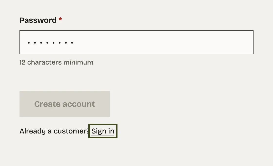
<button type="submit" disabled>Create account</button>
<script>
  form.addEventListener("keyup", () => {
    button.disabled = !fields.every(isValid);
  });
</script>Correct
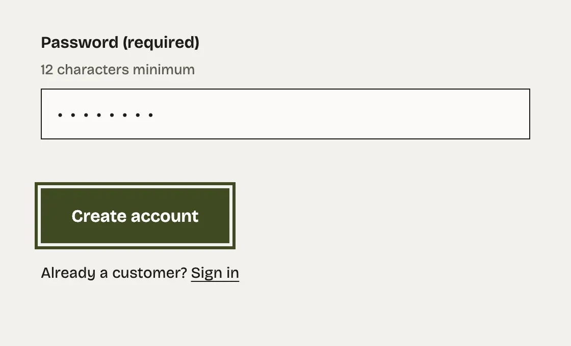
<button type="submit">Create account</button>#Test the fixed form with NVDA and Firefox
Four steps are enough to test this form with NVDA and Firefox: arriving on each field, submitting it empty, following a link in the summary, then fixing the error. Our NVDA screen reader guide covers installing it, its shortcuts and its two modes. Test with the latest stable release, 2026.3.
At each step, judge the information you get: the name, the type, the state (required or in error), the hint and the message. Write down the words you hear as well; they go into a ticket if something is missing.
Casey has filled in all three fields, with “casey@” as the address, and presses Enter in “Password”. Focus moves to the “1 error to fix” summary.
Tab reaches the only link in the summary. Its text matches the message below the field word for word.
Enter on the link puts focus in “Email address”. The message sits below the field, which has aria-invalid="true".
Casey completes the address as “casey@example.com”, and the message disappears as soon as the value is valid. Tab then moves on to the password.
Tab reaches “Create account”, which is enabled. One more press of Enter would submit the form.
Then check these six points on your own form, in order.
Here is the fixed component, ready to copy into your page. The server checks the data again when it arrives: anyone can get around a check that runs in the browser.
<style>
  .error { color: #b42318; font-weight: 600; }
  .error:empty { display: none; }
  [aria-invalid="true"] { border: 2px solid #b42318; }
</style>

<h1>Create your account</h1>

<div id="error-summary" class="error-summary" tabindex="-1" hidden>
  <h2></h2>
  <ul></ul>
</div>

<p>All fields are required.</p>

<form id="account" action="/account" method="post" novalidate>
  <label for="first-name">First name (required)</label>
  <input id="first-name" name="first-name" type="text" required
         autocomplete="given-name" aria-describedby="first-name-error">
  <p id="first-name-error" class="error"></p>

  <label for="email">Email address (required)</label>
  <input id="email" name="email" type="email" required
         autocomplete="email" aria-describedby="email-error">
  <p id="email-error" class="error"></p>

  <label for="password">Password (required)
    <span class="hint">12 characters minimum</span></label>
  <input id="password" name="password" type="password" required minlength="12"
         autocomplete="new-password" aria-describedby="password-error">
  <p id="password-error" class="error"></p>

  <button type="submit">Create account</button>
</form>const form = document.getElementById("account");
const summary = document.getElementById("error-summary");
const fields = [...form.querySelectorAll("input")];
// One message per field and per cause, read from the validity the browser computes.
const messages = {
"first-name": { valueMissing: "Enter your first name" },
email: {
valueMissing: "Enter your email address",
typeMismatch: "Enter an email address in the format name@example.com",
},
password: {
valueMissing: "Choose a password",
tooShort: "Choose a password with at least 12 characters",
},
};
const messageFor = (field) =>
Object.entries(messages[field.id]).find(([cause]) => field.validity[cause])?.[1];
form.addEventListener("submit", (event) => {
const errors = fields.filter((field) => !field.checkValidity());
if (!errors.length) return; // the form is sent, and the server checks again
event.preventDefault();
for (const field of errors) {
document.getElementById(`${field.id}-error`).textContent = messageFor(field);
field.setAttribute("aria-invalid", "true");
}
summary.querySelector("h2").textContent =
errors.length > 1 ? `${errors.length} errors to fix` : "1 error to fix";
summary.querySelector("ul").replaceChildren(
...errors.map((field) => {
const link = document.createElement("a");
link.href = `#${field.id}`;
link.textContent = messageFor(field);
const item = document.createElement("li");
item.append(link);
return item;
}),
);
summary.hidden = false;
summary.focus();
});
// A flagged field loses its message as soon as its value is valid.
form.addEventListener("input", (event) => {
const field = event.target;
if (field.getAttribute("aria-invalid") === "true" && field.checkValidity()) {
document.getElementById(`${field.id}-error`).textContent = "";
field.removeAttribute("aria-invalid");
}
});
// A summary link moves focus into its field.
summary.addEventListener("click", (event) => {
const link = event.target.closest("a");
if (!link) return;
event.preventDefault();
document.querySelector(link.hash).focus();
});Umbel's next forms, the newsletter sign-up or the shipping address, can go through an Includdy scan as soon as they exist. For each issue, guided remediation shows the failing code beside a compliant component, for you to review before merging it. A test plan also gives the whole team steps to replay, each with its expected result.