
Focus visible: how to style the focus indicator in CSS


When a design team strips the outline from clicked buttons, sighted keyboard users lose track of where they are. That outline is the focus indicator: it shows which element will get the next key press. With :focus-visible, you hide it on mouse click and keep it for the keyboard. Below you'll find a style that stays readable on any solid background, and how to test it.
One focus style, from CSS to testing
#What the keyboard focus indicator is for?
The focus indicator shows on screen which element the next key press will reach. That element has the focus: the link that Enter will open, the field where your typing appears. Most of the time the indicator is an outline, as on the website of Balance Wheel Watch Repair, a shop we'll follow all the way to the test.
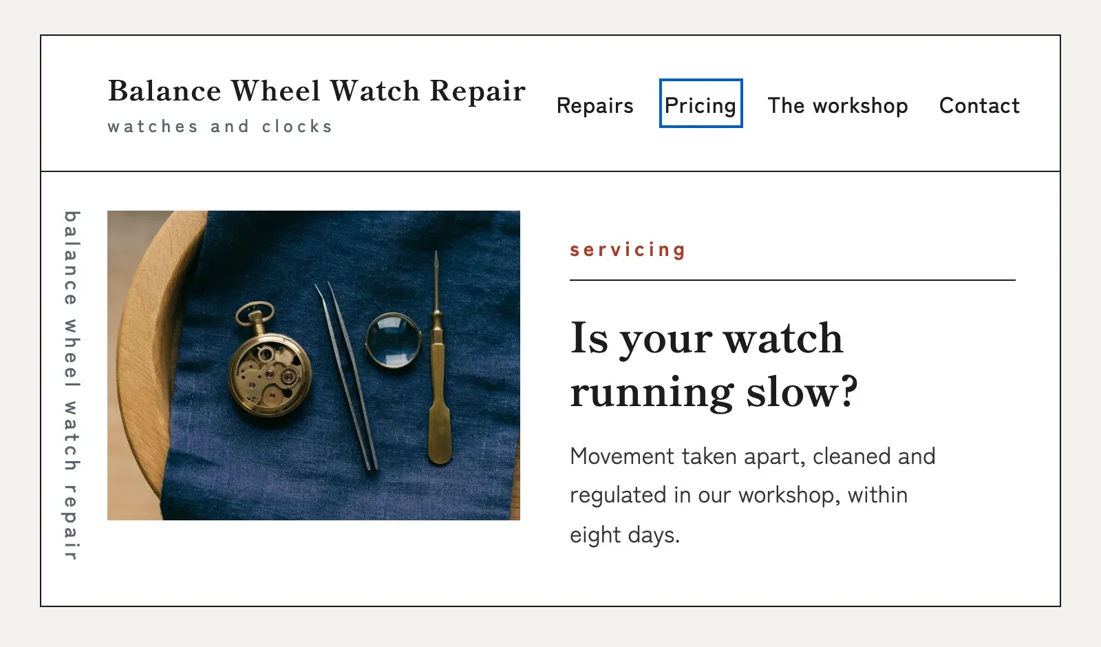
Without that outline, a sighted person using the keyboard can't tell where they are. It helps:
- people who can't use a mouse or need to avoid one, because of a motor disability, repetitive strain pain or an arm in a cast;
- people who control the computer by voice, with an on-screen keyboard or with a switch (an adapted button), since these tools act like a keyboard;
- people with low vision who zoom in and only see part of the screen at a time;
- people with attention or memory difficulties, who need to find their place again.
Blind people use the keyboard as well, but a screen reader guides them by reading the page aloud. The outline is first of all for people who can see the screen.
For years, browsers drew this outline on almost anything that received focus, even a clicked button. Many people found it ugly, and plenty of sites removed it, and everyone on that list lost the one cue they relied on.
Browsers now show their outline only when it helps, mostly for the keyboard. In 2020, Chrome also replaced its light outline with a dark ring edged with a thin white line, so it stands out on both light and dark backgrounds.
#Which rules require a visible focus?
WCAG, the web accessibility guidelines, requires a visible focus in its Focus Visible criterion, at level AA. The criterion dates back to the first version of WCAG 2, so every version that US law points to includes it. Federal agencies follow Section 508, built on WCAG 2.0. State and local governments follow the ADA Title II rule, built on the next version. In Europe, the European Accessibility Act sets the goals and EN 301 549, the standard that turns them into testable requirements, repeats Focus Visible for web pages.
#How to remove the focus outline on click and keep it for the keyboard?
Put your focus style on :focus-visible, the selector that makes this distinction. The :focus selector applies every time an element gets focus, mouse clicks included. :focus-visible applies only when the browser decides focus is worth showing: during keyboard navigation, and always in fields where people type text.
When a script moves focus, as after a route change in a React app, the new element usually shows the ring only if the previous one did. A third selector, :focus-within, matches an element when it or something inside it has focus, such as a card whose link is focused.
Browsers already use :focus-visible for their own default style, so a clicked button normally shows no ring at all. If your designer sees one on click, look first for a :focus rule in the site's CSS or in a component library. On a text input, the ring on click is intended: people need to see where they are typing.
#Why outline: none on :focus fails WCAG?
Many sites did the opposite, with an outline: none rule on :focus that removes the ring for everyone, keyboard users included. When no other indicator replaces it, the W3C, which publishes WCAG, lists this rule among the failures of Focus Visible. Delete those rules.
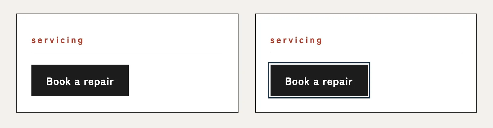
Avoid
 Marker 1. The Book a repair button, with no focus outline.
*:focus {
  outline: none;
}Correct
 Marker 1. The Book a repair button, with the very dark blue focus outline around it.
:focus-visible {
  outline: 2px solid #193146;
  outline-offset: 2px;
}Why. The browser already decides when to show the ring, and your CSS only has to decide what it looks like.
That makes the old :focus:not(:focus-visible) trick and the focus-visible npm polyfill unnecessary. The selector has worked in every major browser since March 2022, and the polyfill is no longer maintained.
#Which focus ring style works across the whole site?
Draw the indicator with outline on :focus-visible, and keep its colors in CSS custom properties. An outline takes up no space, so nothing shifts when it appears, and it follows the rounded corners set by border-radius.
The higher the contrast between two colors, the easier they are to tell apart. An indicator drawn around the element needs at least 3:1 against the background the element sits on, as WCAG requires. Measure each background with the color contrast checker.
A site with backgrounds in several colors runs into a problem: one indicator color may not contrast with all of them, and with one color per area, some components always get missed. That is why a W3C technique draws the indicator in two colors. If the two reach 9:1 against each other, one of them reaches 3:1 on any solid background. The guarantee holds for an indicator drawn around the element on a single-color background; on a photo or a gradient, measure.
#The two-color focus ring on the demo site
Balance Wheel Watch Repair fits this case. Its page is white, and its navy footer, #0F172A, holds the newsletter form. Its current focus style, a 2 px blue #005FCC outline, reaches 5.98:1 on the white page and passes. In the footer it drops to 2.98:1 and fails, because WCAG never rounds a ratio up.
The W3C pair, near-white #F9F9F9 and very dark blue #193146, gives 12.71:1 between its two colors, above the 9:1 it needs. On the white page, the dark band carries the contrast at 13.38:1. In the footer, the light band takes over at 16.96:1.
The style to copy:
:root {
  --focus-light: #F9F9F9;
  --focus-dark: #193146;
}

:focus-visible {
  outline: 2px solid var(--focus-light);
  outline-offset: 0;
  box-shadow: 0 0 0 4px var(--focus-dark);
}Why. The outline draws the light band against the element, and the shadow draws the dark band around it: each band is 2 px wide.
#Getting the focus state into the design
On its own, each 2 px band is also large enough for Focus Appearance (2.4.13), the strictest level, AAA. Aim for it from the first mockup, so the team only designs focus once.
To keep design from removing it again, get the focus state into the mockups. Spec both colors for every interactive element: a 2 px light band #F9F9F9 against the element and a 2 px dark band #193146 around it.
#Why a box-shadow focus ring disappears in Windows high contrast mode?
When Windows high contrast is on, a focus style drawn with a shadow alone disappears, because the browser removes every box-shadow. This setting is one case of forced colors mode, where the browser replaces the page's colors with a few colors the user picked. An outline stays visible in one of the theme's colors, which is why the style above draws its light band with outline.
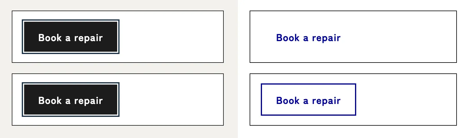
If a component has to keep a shadow-only focus, add outline: 2px solid transparent to its focus style. That outline stays invisible in normal colors and shows up in forced colors. Also avoid adding a border on focus: it takes up space, so the content shifts every time.
#Tailwind ring and outline-none in forced colors
In Tailwind, the ring class produces a box-shadow, so it disappears in forced colors. Version 4 also changed what one class means. In v3, outline-none set a transparent outline, which forced colors made visible. In v4, that transparent outline is called outline-hidden, and outline-none removes the outline entirely.
A project upgraded to v4 by hand that keeps focus:outline-none therefore loses its focus indicator in forced colors. Pair every ring with outline-hidden, or switch to the outline classes.
| Focus style | In forced colors |
|---|---|
outline | Stays visible, in a theme color |
box-shadow alone | Disappears |
Tailwind ring | Disappears, like any box-shadow |
box-shadow with outline: 2px solid transparent | The outline shows, in a theme color |
outline-hidden (Tailwind v4) | The outline shows |
outline-none (Tailwind v4) | No indicator left |
#How to test focus visible with the keyboard?
On each page template, go down the tab order with Tab to the footer, then back up with Shift+Tab. Every element should show the indicator. Focus Not Obscured (2.4.11) also asks that none of them end up fully hidden under a sticky header, one that stays pinned to the top of the screen.
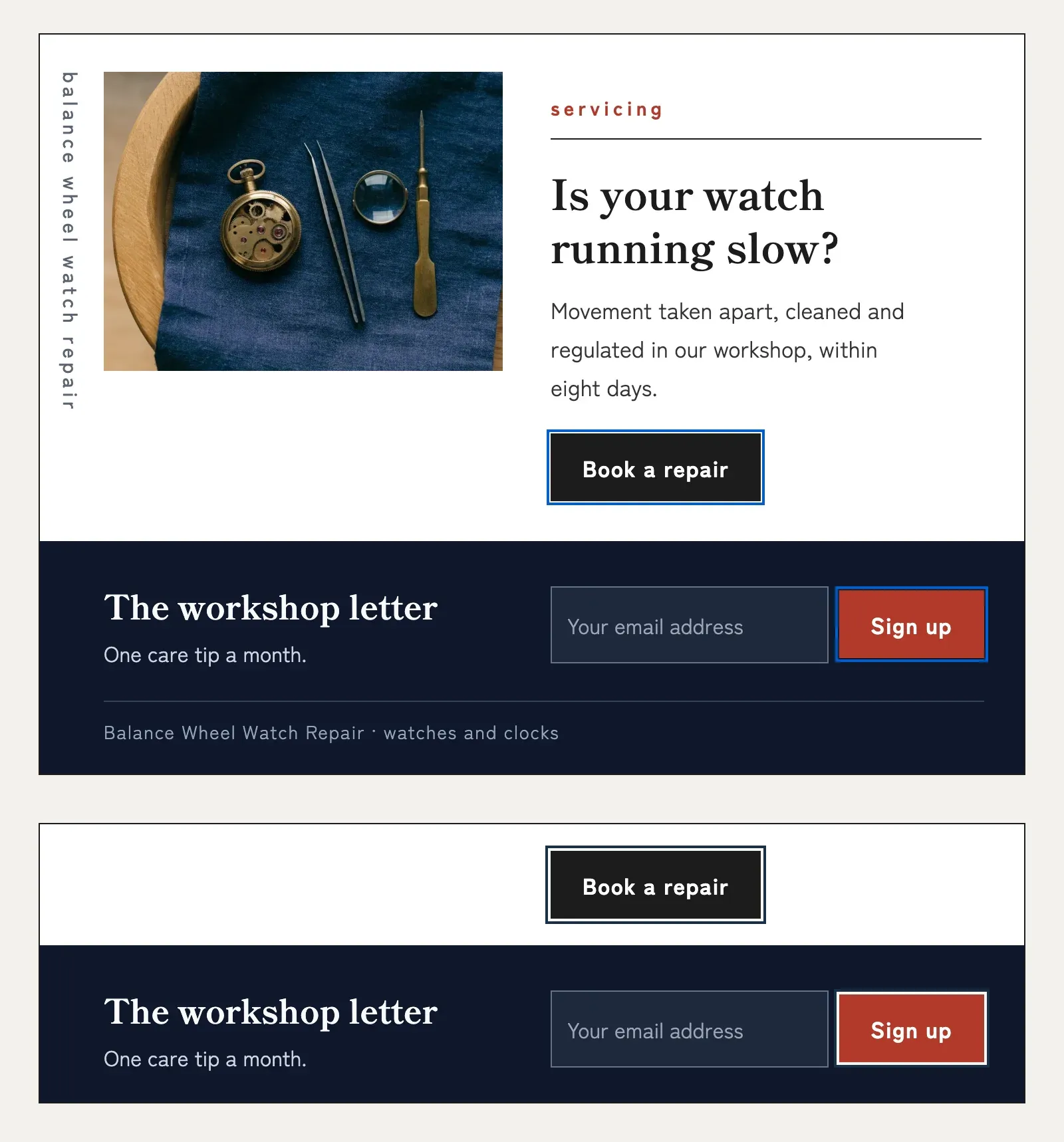
The first press reaches the logo.
After the menu links, the ring moves to the button.
On the navy footer, the light band stands out.
The Sign up button, the last element on the page, shows the ring as well.
Shift+Tab goes back in reverse order: the ring returns to the email field.
Then switch to the mouse. Clicking a button should show no ring, while clicking into a text input shows it.
To simulate forced colors in Chrome, open DevTools, then the Rendering panel. Pick forced-colors: active and run through the page again. If the site has a dark theme, repeat with prefers-color-scheme: dark.
On a Mac, Safari needs two settings, because by default Tab only stops on form fields and pop-up menus there. In Safari's Advanced settings, turn on the option for Tab to highlight each item, then turn on keyboard navigation in the Keyboard section of macOS System Settings. Safari also doesn't give focus to a clicked button, so no ring shows on click there, whatever the CSS says.
Before you ship, check:
Focus can also land on a transparent element: on a product page of the Shopify Horizon theme demo, which Lighthouse scores 95, the eighth press of Tab reaches an invisible button.
Our guide to the new criteria of WCAG 2.2 shows the CSS fix for a sticky header that hides focus.
 RGAA 5: get compliant before the new version is released